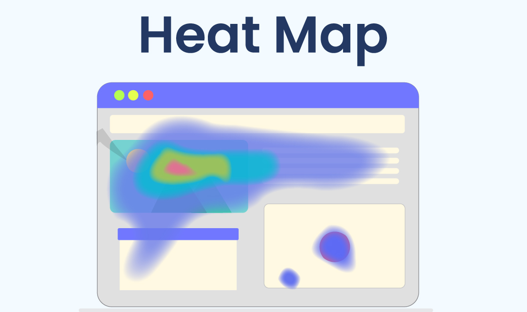
Development of heat maps dated back to the 19th century to provide a graphical representation of complex data so that it is easier for humans to analyze at-a-glance. Back then, a gray-scale shading was used to depict data patterns and the darker color was used to indicated dense values while lighter color was used to depict lesser values. A few applications of heat maps include depicting weather reports, real estate market data, and financial market analysis. The beauty of using heat maps is that you don't have to read a table of data in rows and columns to understand complex data, but rather view a simple colored map to grasp the big picture of data representation.
In the web development and Internet marketing industry, we use analytics tools such as Google Analytics and Adobe Site Catalys to understand how many webpages are viewed, how many newsletter subscriptions were obtained, and how many orders have been received from a particular traffic source. However, analytics lack capturing user behaviors like where users have clicked and how far down users have scrolled on a webpage. A heat map is a supplemental tool that provides information about user engagements, an area where the user clicks, and the area where the user spends the most time.
What is a website heat map?
A heat map is a graphical tool that shows a map of a webpage with a color-coded image to visually show you which area of the page received the most attention. A heat map uses warm color (red) to indicate user clicks and attention, and cold color (blue) to indicate fewer attentions. This is why it is called a heat map and is indicating the hot area by its color. By using colors, heat maps provide an at-a-glance view of user engagements, clicks, and attention. The following data can be captured from viewing heat maps.
- A heat map provides a visual representation of the most popular elements on a webpage in hot (red) color and less popular elements in cold (blue) color.
- A heat map can be used to show where users have clicked and where they spent most of their time.
- A heat map shows how far a user has scrolled down a page, depicts areas where the user ignored the contents, and used to track the user's area of focus.
- There is three types of heat maps: Click map (measure user clicks), Scroll map (measures user scrolls), and Confetti map (measures referral segments - i.e. traffic source).
Heat maps provide a comprehensive view of user engagements, how users are interacting with the page, and also provide areas of improvement in developing an actionable elements. There are severl heat map tools available for webmasters, and they include Hotjar, Crazy Egg and Clicktale. For low traffic websites (2K pageviews / day), Hot Jar offers a free plan which you can use to anlayze your site data.
Conclusion
Heat maps by themselves will not provide you with analytical data, but they will offer greater insights into your users' activities and engagements on the website. By using heat maps with analytics, you will have a complete picture of how your users are using the website. Heat maps also provide an area of improvement so that more actionable elements can be designed to increase conversion rates.
Share this post
Leave a comment
All comments are moderated. Spammy and bot submitted comments are deleted. Please submit the comments that are helpful to others, and we'll approve your comments. A comment that includes outbound link will only be approved if the content is relevant to the topic, and has some value to our readers.

Comments (0)
No comment